Case Study — Brand Identity — Business Consultancy — Kenya

Coruscate Consultancy

Role

Full Brand Development

Focus

Identity, Collateral & Web

Period

2024–2025

Engagement

End-to-End Brand Build, Nairobi

Overview

Coruscate Consultancy Ltd is a Nairobi-based strategic business consultancy — a team of seasoned experts helping organisations grow through tailored strategy, operational efficiency, and cutting-edge thinking. It’s also part of the wider Rikara Group, so the identity had to feel at home beside a serious institutional portfolio.

I built the brand end to end: the logo and visual identity, the full brand guideline, a complete stationery and collateral suite, email-signature templates, the company profile, and the design of the consultancy’s website.

The Brief

Coruscate means to shine, to sparkle with brilliance — a high bar for a name. The brand had to live up to it while staying firmly in consultancy territory: trustworthy, precise, and quietly confident, never flashy. The kind of identity a CFO takes seriously and a founder finds approachable.

It also had to be a genuine system. A consultancy runs on documents — proposals, letters, profiles, agreements, email — so the brand had to hold together across a lot of dense, text-heavy touchpoints without ever looking generic.

Approach

A monogram built from the name. The mark interlocks two “C”s — Coruscate Consultancy — into a single circular emblem: one arc in Mariner blue, one in deep Pickled Bluewood, with a fine striation where they meet that hints at precision and forward motion. It reads instantly as a “C,” works as a standalone emblem, and holds up from a favicon to a signboard.

A considered corporate palette. Pickled Bluewood for authority, Mariner blue for energy and clarity, granite gray for balance — with black and two lighter blues for range. Confident and corporate without the cliché of yet another flat navy logo.

Type with a job for each role. Century Gothic for headlines — geometric, high-legibility, bold in signage; Futura Bk BT for body — clean, neutral, and readable across long documents and screens.

Logo & Monogram System Brand Guideline Colour & Typography Stationery & Collateral Email Signatures Company Profile Website Design

Brand Identity

The logo works as a full horizontal lockup — the interlocking-C emblem beside the “CORUSCATE / CONSULTANCY” wordmark — and as a standalone emblem. Defined full-colour, white, and single-colour variants keep it sharp on light, dark, and photographic backgrounds alike.

Pickled Bluewood#2C3E50
Mariner Blue#1F77D0
Granite Gray#606060
Raisin Black#232323

Coruscate Consultancy logo, white version, on Pickled Bluewood

Reversed — on Pickled Bluewood

Coruscate Consultancy full-colour logo lockup

Full-Colour Lockup

Collateral Suite

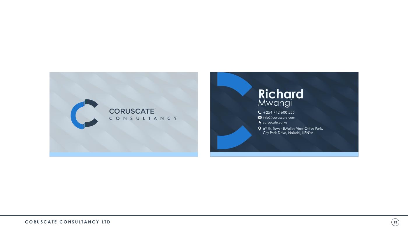
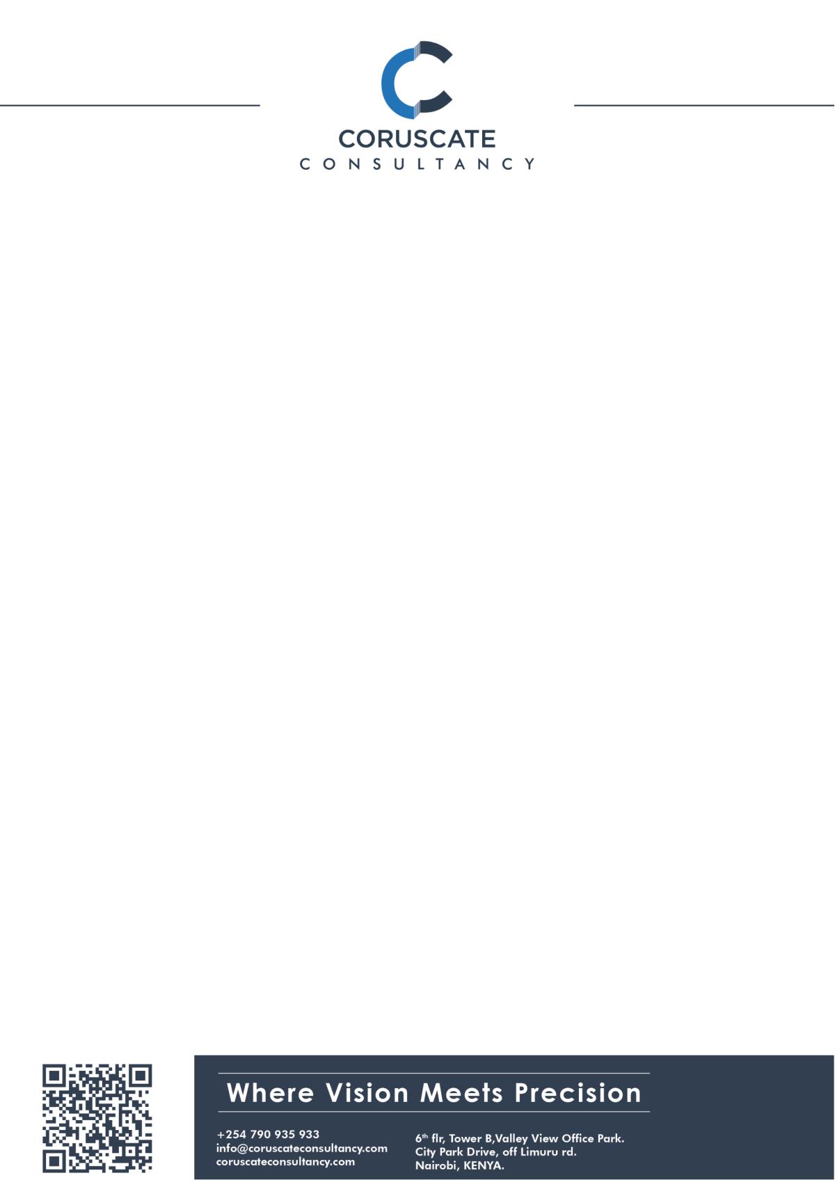
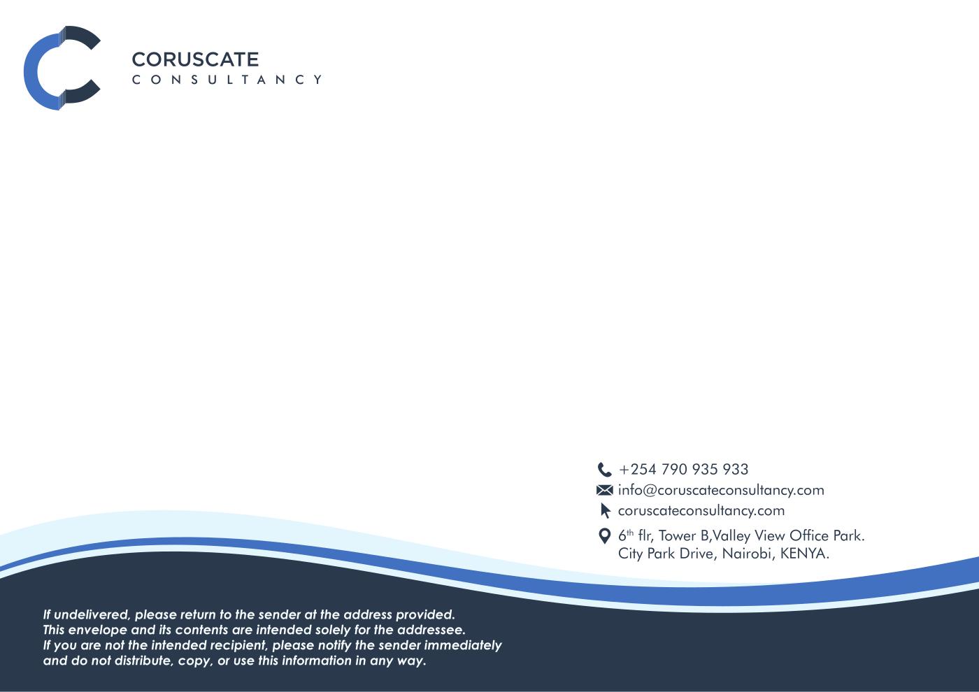
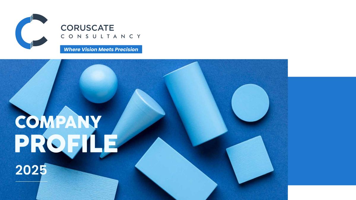
A consultancy is only as credible as its paperwork looks. The identity runs through a full business suite — two-sided business cards, a branded letterhead, envelope, email-signature banners, and a company profile — every piece sharing the same grid, palette, and monogram so a proposal, a cover letter, and an email all read as one firm.

Coruscate two-sided business card design
Stationery — Business Cards
Coruscate letterhead design
Stationery — Letterhead
Coruscate branded envelope design
Stationery — Envelope
Coruscate company profile cover
Company Profile
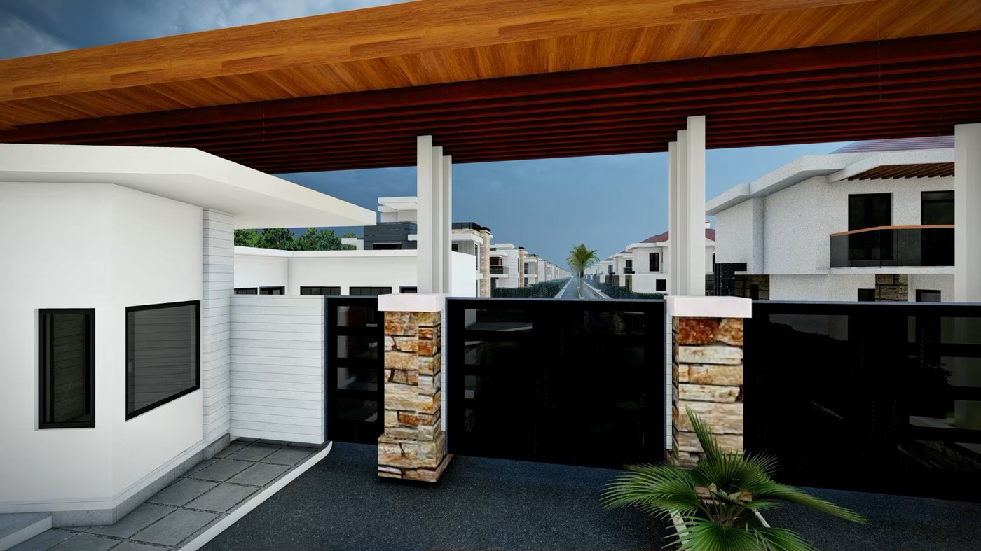
Coruscate Homes architectural render
Coruscate Homes — 3D Render

The Website

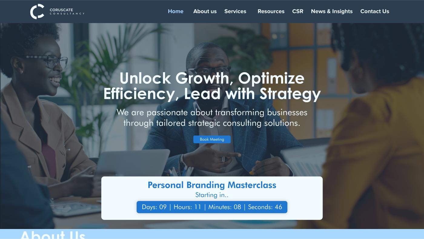
The website carries the identity online with the same corporate confidence — a clear structure (Home, About, Services, Resources, CSR, News & Insights, Contact) led by the brand’s promise: “Unlock Growth, Optimize Efficiency, Lead with Strategy.” A prominent Book Meeting action and an events countdown turn visitors into conversations.

Coruscate Consultancy website home page design
Website — Home Page

Outcome

  • A name-driven monogram — two interlocking C’s that read instantly, scale anywhere, and give a consultancy a mark with real personality
  • A complete brand guideline — logo variants, colour, and typography rules that keep every touchpoint on-system
  • A full business collateral suite — cards, letterhead, envelope, email signatures, and a company profile, all coherent
  • A corporate website design carrying the identity online with a clear path to book a meeting
  • A credible, boardroom-ready brand that sits comfortably within the Rikara Group portfolio

If this is you

If your firm does serious work but looks like its competitors, you're leaving credibility on the table. I give you an identity a CFO takes seriously and a founder finds approachable.

Next case study

Rikara Group Holdings

Want a brand that
actually shines?

Talk to Me