Case Study — Corporate Identity — Diversified Holdings — Kenya

Rikara Group Holdings

Role

Brand Identity, Design & Web

Focus

Corporate Identity, Document Design, Website

Period

2025

Engagement

Full Brand Build, Nairobi, Kenya

Overview

Rikara Group Holdings Ltd is a diversified Kenyan holding company with interests spanning financial services, real estate, energy, manufacturing, advisory, and distribution. Its name is its operating philosophy — Research Ideas, Kick-start Analysis, Redefine Approach — under a single promise: redefining what's possible.

The engagement covered the full brand identity, the visual system that carries it, a suite of corporate documents, and the company website.

The Brief

A holding company has a harder identity problem than a single-product business: one mark has to read as credible across industries that look nothing like each other — a solar project, an insurance product, an affordable-housing development, a manufacturing line. Too specific and it fights half the portfolio; too generic and it says nothing.

Rikara needed an identity with the institutional weight to sit in a boardroom and an investor deck, while staying distinctive enough not to disappear into the sea of interchangeable corporate red-and-grey logos.

Approach

One mark, made personal. The identity is anchored by a single hand-drawn monogram — a continuous, calligraphic "R" that reads as a signature. It gives an otherwise formal, multi-sector holding company a human, authored quality, so the brand feels like a point of view rather than a committee.

A disciplined system, not just a logo. A tight palette (a single confident red, graphite, and white), a clear type hierarchy, and strict placement rules — built so the brand holds together whether it's on a 75-page profile, a business envelope, or a website header.

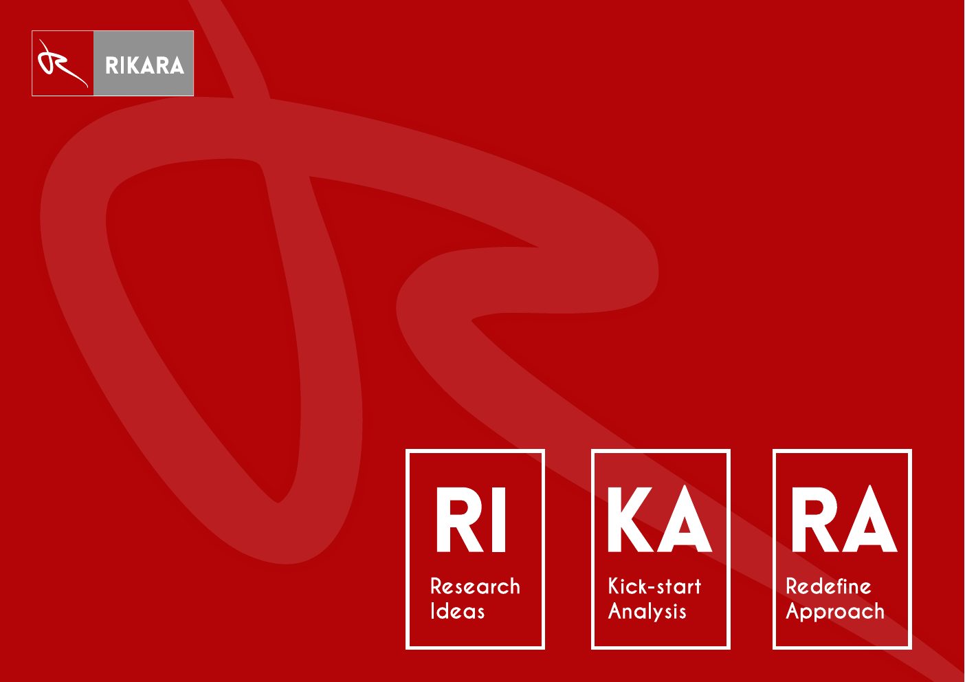
Name as narrative. The RIKARA acronym is built into the visual language: RI · KA · RA broken into framed blocks — Research Ideas, Kick-start Analysis, Redefine Approach — so the company's method is legible at a glance.

Logo & Monogram System Colour & Type System Company Profile (75pp) HR Induction Manual (132pp) Stationery & Envelopes Website Design

Brand Identity

The monogram works as a full lockup with the RIKARA wordmark, and as a standalone emblem — a white mark on the brand red — that scales down to a favicon or app tile without losing its character. Red carries confidence and energy; graphite grounds it; white keeps it clean and legible across print and screen.

Rikara Red#B30507
Graphite#6E7073
White#FFFFFF

Rikara emblem — white calligraphic R monogram on the brand red

The Emblem

Rikara full logo lockup — monogram with the RIKARA wordmark and RI KA RA method blocks

Full Lockup & RI · KA · RA System
Document Suite

The identity was built to be lived in, not just admired on a guidelines page. It runs through a full corporate document suite — a 75-page company profile, a 132-page HR induction manual, and a set of business stationery — all sharing the same grid, colour discipline, and photographic treatment, so every touchpoint reads unmistakably as Rikara.

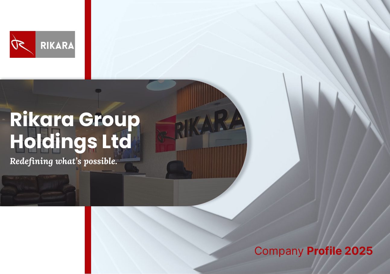
Rikara Company Profile 2025 cover
Company Profile — Cover
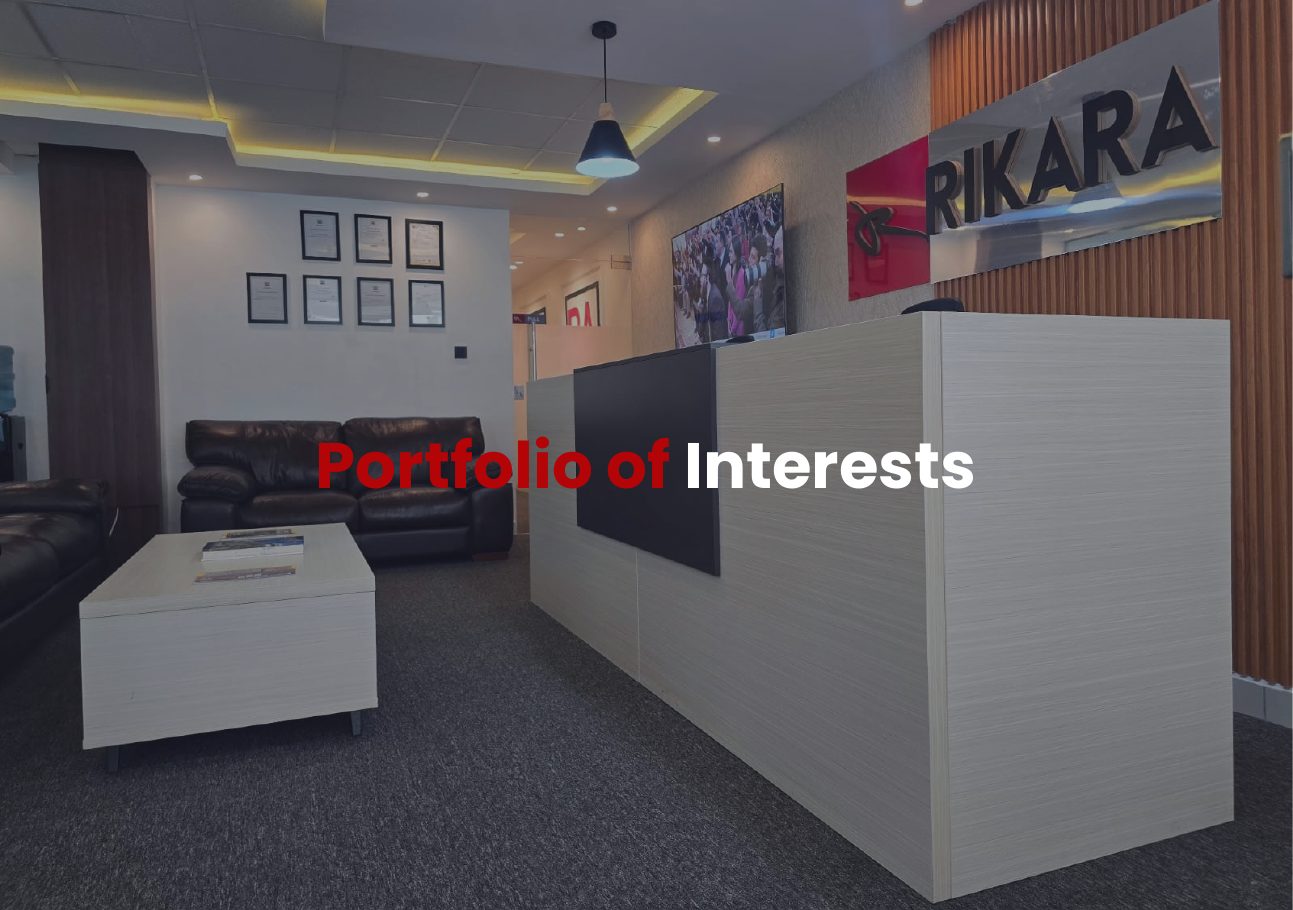
Company Profile — Portfolio of Interests section
Profile — Portfolio of Interests
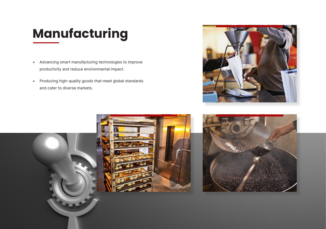
Company Profile — sector spread
Profile — Sector Spread
Rikara HR Induction manual cover
HR Induction Manual
Rikara branded A4 envelope design
Stationery — A4 Envelope

The Website

The website extends the same system to the screen: the red field, the monogram, and the RI · KA · RA method translated into a digital home for the group and its portfolio. It gives a multi-sector holding company one authoritative address, structured so each area of interest — financial services, real estate, energy, manufacturing — has room to breathe under one coherent brand.

Visit rikaragroupholdings.com →

Outcome

  • A complete identity system — hand-drawn monogram, full lockup, standalone emblem, colour, and type — built to hold across a six-sector portfolio
  • The RIKARA method made visible — Research Ideas, Kick-start Analysis, Redefine Approach turned into a repeatable RI · KA · RA visual device
  • A brand-consistent document suite — 75-page company profile, 132-page HR induction manual, and business stationery on one shared system
  • A corporate website carrying the identity to screen, giving the group a single authoritative home
  • One coherent brand across print, stationery, and web — credible in a boardroom, distinctive in a crowded corporate field

If this is you

If you hold a portfolio of companies under one roof, I build the master brand that ties them together while keeping each one distinct.

Next case study

Akiba Bank

Need one brand
to hold a whole portfolio?

Talk to Me