Case Study — Brand Identity — Cancer Support NGO — Kenya
Sprout & Live Hope Foundation is a Kenyan non-profit walking alongside cancer patients, survivors, and their families — through awareness, care, counselling, and community. Its whole reason for being fits in one line the brand had to carry everywhere: “Cancer is not a death sentence — it’s a journey of hope.”
I led the brand from a blank page to a working identity: the name concept, the logo, the colour and visual system, a full suite of print and merchandise collateral, and the design of the foundation’s website and mobile app.
Cancer branding tends to pull in two unhelpful directions: clinical and cold, or heavy and grief-soaked. For a foundation whose entire message is hope, neither works. The identity had to hold two truths at once — the seriousness of the diagnosis and the possibility of life beyond it — without tipping into either sterile or sombre.
It also had to work hard and travel far: warm enough to comfort a newly-diagnosed patient, credible enough to stand in front of partners and donors, and flexible enough to live on everything from a support-group t-shirt to a hospital-corridor banner to a phone screen.
A symbol that says “grow.” The mark is a sprout cradled in an open hand. The sprout stands for new beginnings and growth — the patient rising above the diagnosis. The hand beneath it stands for care, protection, and guidance — the foundation’s nurturing role. Together, intertwined, they carry the deeper message: no one walks the cancer journey alone.
Colour with meaning. Purple for healing and strength; pink for compassion and emotional care; a soft off-white as the brand’s “white.” The palette nods to the ribbon language of cancer advocacy while feeling distinctly warm and human.
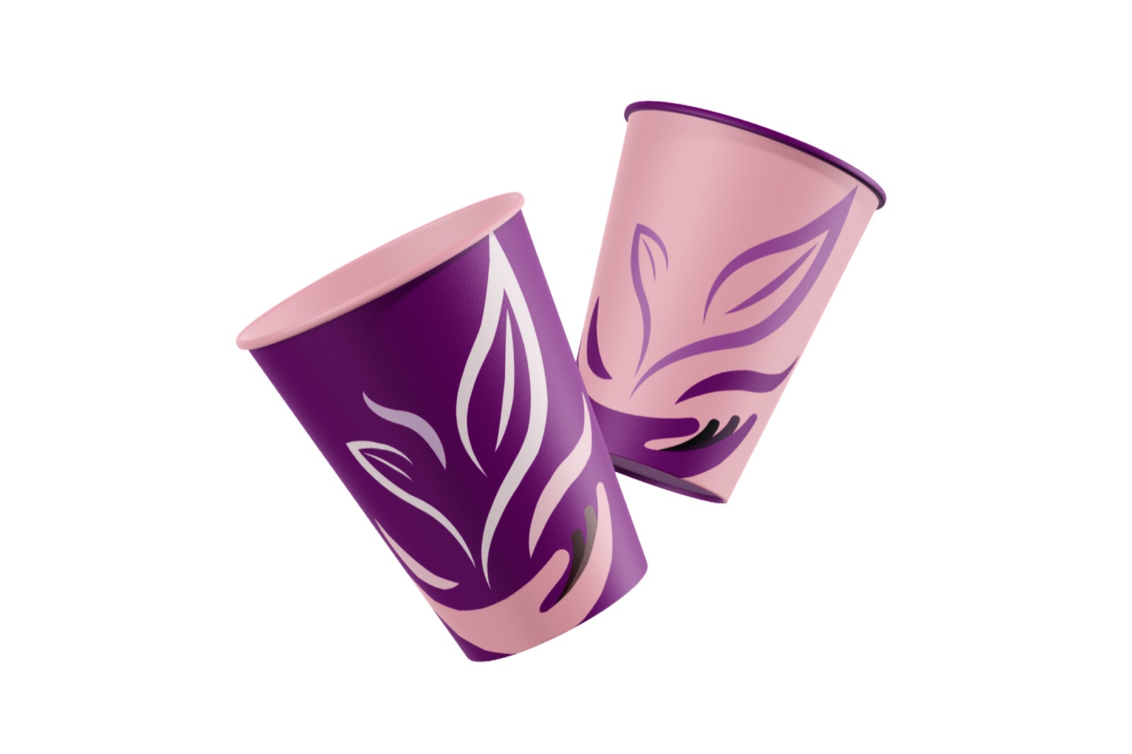
A system, not just a logo. A hand-drawn wordmark, a repeatable leaf pattern, defined logo variants for light and dark grounds, and clear rules — so the brand stays unmistakably itself across dozens of touchpoints.
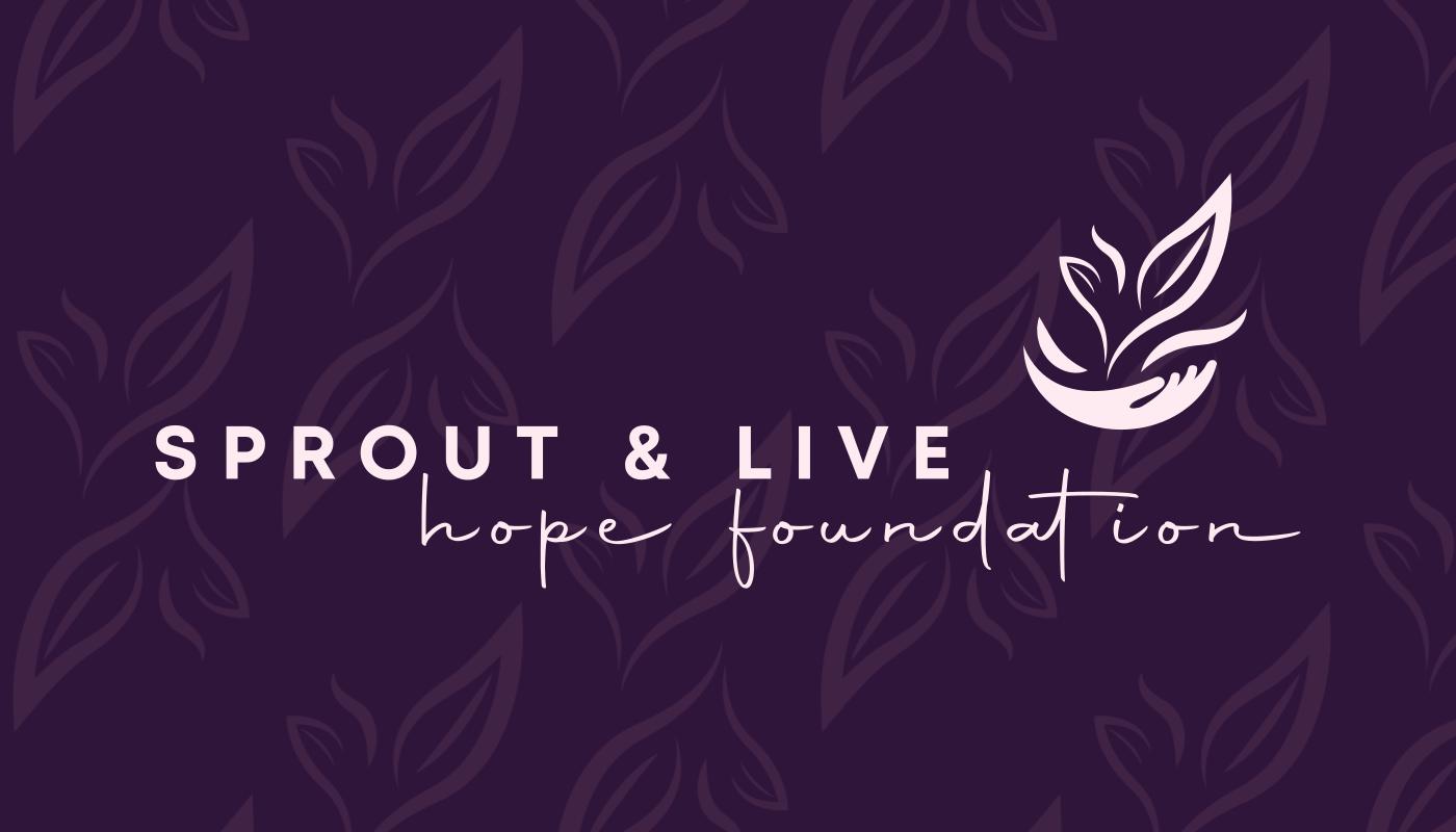
The logo works as a full lockup — the sprout-in-hand emblem beside the “Sprout & Live / hope foundation” wordmark — and as a standalone emblem that scales down to an app icon or a lapel pin. Defined light and dark variants keep it legible on every background, from deep purple to soft pink to plain white.
The Emblem — Sprout & Supporting Hand
Full Lockup
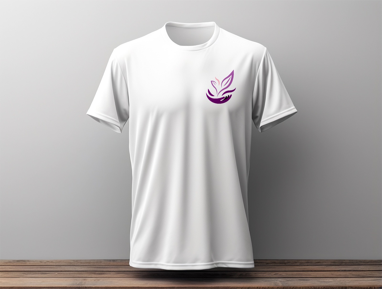
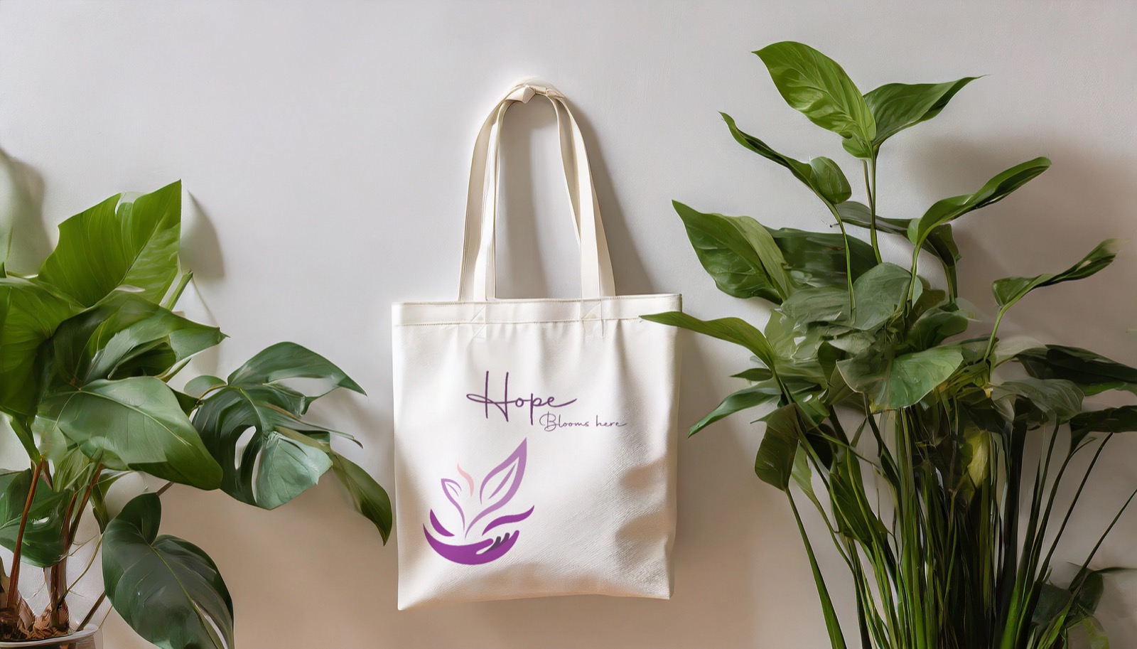
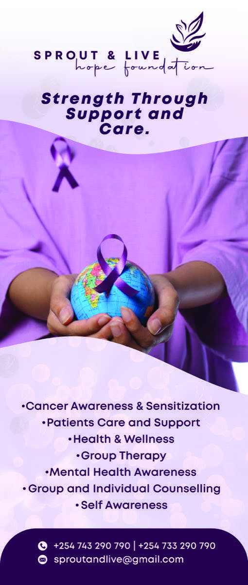
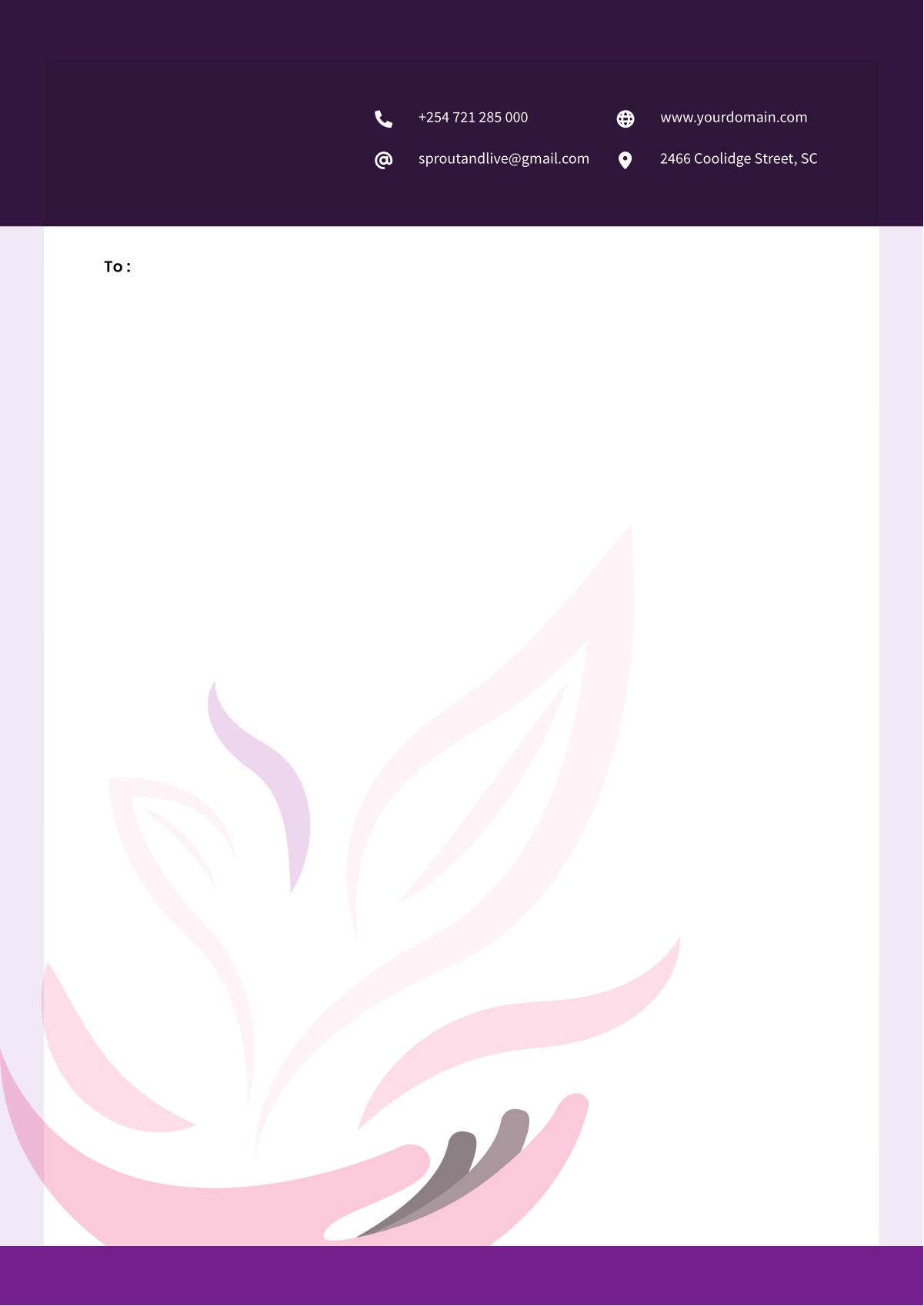
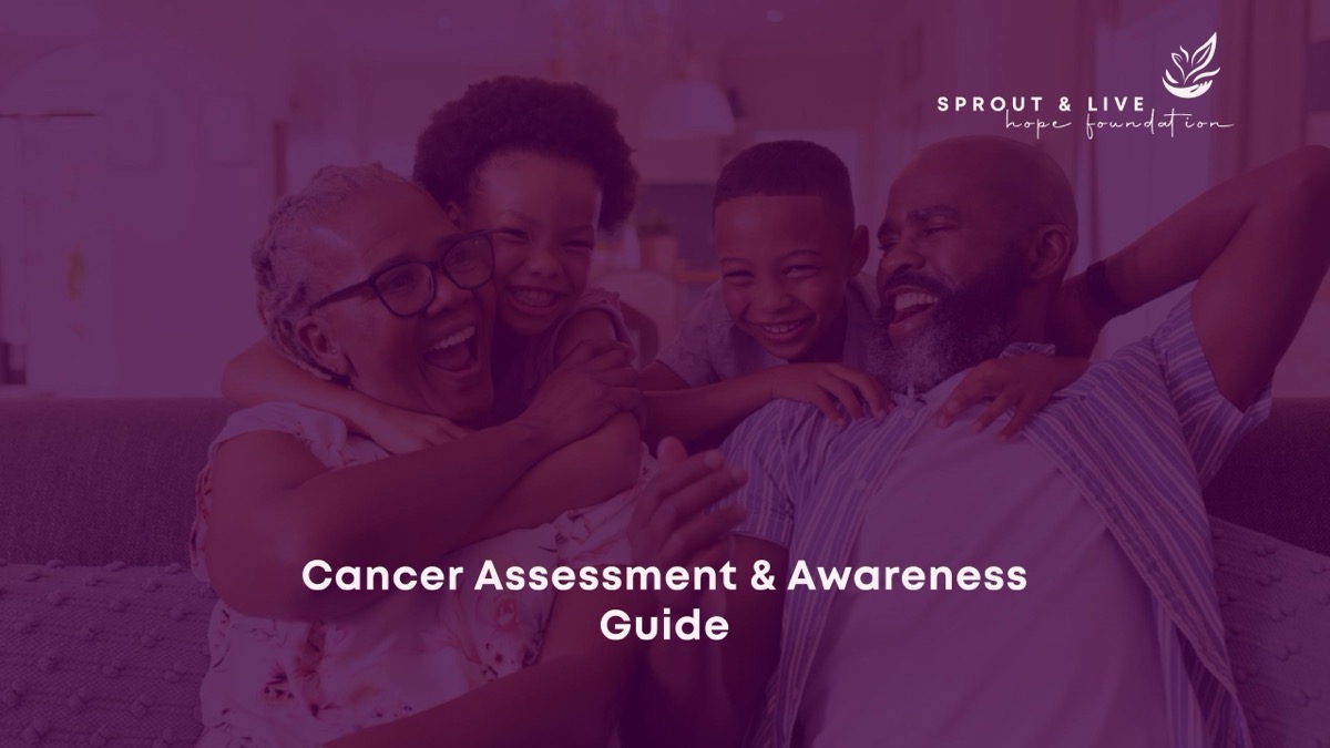
The identity was built to be handed out, worn, carried, and read — not just filed in a guidelines PDF. It runs across a full collateral suite: business stationery, branded merchandise, event banners, and a patient-facing Cancer Assessment & Awareness Guide, all sharing one grid, one palette, and the same leaf motif.
The brand extends to the screen through a website and a member app. The site gives the foundation a home for its story and its community — Home, About, Services, Events, Gallery, Volunteers, Contacts — led by the message that greets every visitor: “Cancer is not a death sentence, it’s a journey of hope.” A clear Become a Member path turns visitors into a support network.
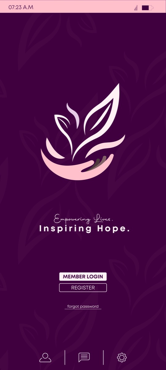
The mobile app carries the same warmth — the emblem on deep purple, the line “Empowering Lives. Inspiring Hope.”, and simple member login, so patients and volunteers can stay connected between events.
If this is you
If you're building something that has to mean something, a cause or a foundation, I give it a brand with heart and rigour in equal measure, so people believe it and remember it.
Next case study
Rikara Group Holdings →