Case Study — Brand Identity — Painting Company — Norway
DavidB Maling Firma (Norwegian for “DavidB Painting Company”) is a modern painting firm serving homes and businesses across Norway — residential and commercial work, eco-friendly finishes, decorative and custom work, and long-term maintenance. Its founder’s belief sets the tone: painting is “more than just colour on a wall — it’s an opportunity to create atmosphere, elevate spaces, and add value.”
I gave that belief a face: a complete logo and identity system, and the design of the company profile that introduces the firm to clients.
Painting is a crowded, commoditised trade — most brands in it look interchangeable: a roller icon, a splash of primary colour, a generic sans-serif. DavidB wanted to sit a clear notch above that: a firm that reads as craft and care, closer to a boutique studio than a van-and-ladder outfit, while still saying, unmistakably, “we paint buildings.”
The identity also had to carry a Nordic sense of quality — clean, considered, premium — and hold together across a document as image-led as a company profile.
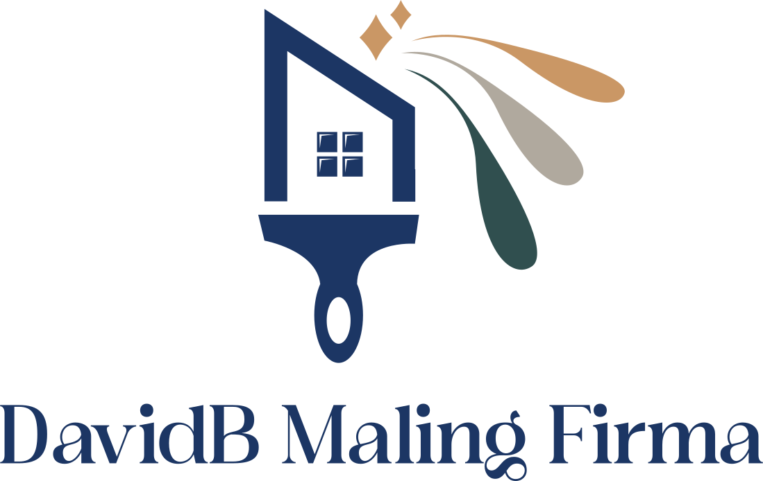
An emblem that tells the whole story in one glance. A house drawn from a single paintbrush — the brush is the building — with a four-pane window and a flourish of paint arcing off the roof in three colours, capped with a sparkle. Property, craft, and a beautiful finish, in one mark.
A palette that feels premium, not primary. A deep, trustworthy navy anchors the brand; warm ochre gold adds the “boutique” lift; pine teal and soft taupe round it out. It’s a paint company that doesn’t reach for the obvious bright primaries — which is exactly what makes it look considered.
A display serif for character. An elegant serif wordmark gives the name warmth and permanence — a firm with roots, not a here-today logo.
The logo works as a full lockup — the house-and-brush emblem above the “DavidB Maling Firma” serif wordmark — with defined full-colour and reversed white variants so it stays crisp on light walls, deep navy, and photography alike.
Reversed — on Deep Navy
Full-Colour Lockup
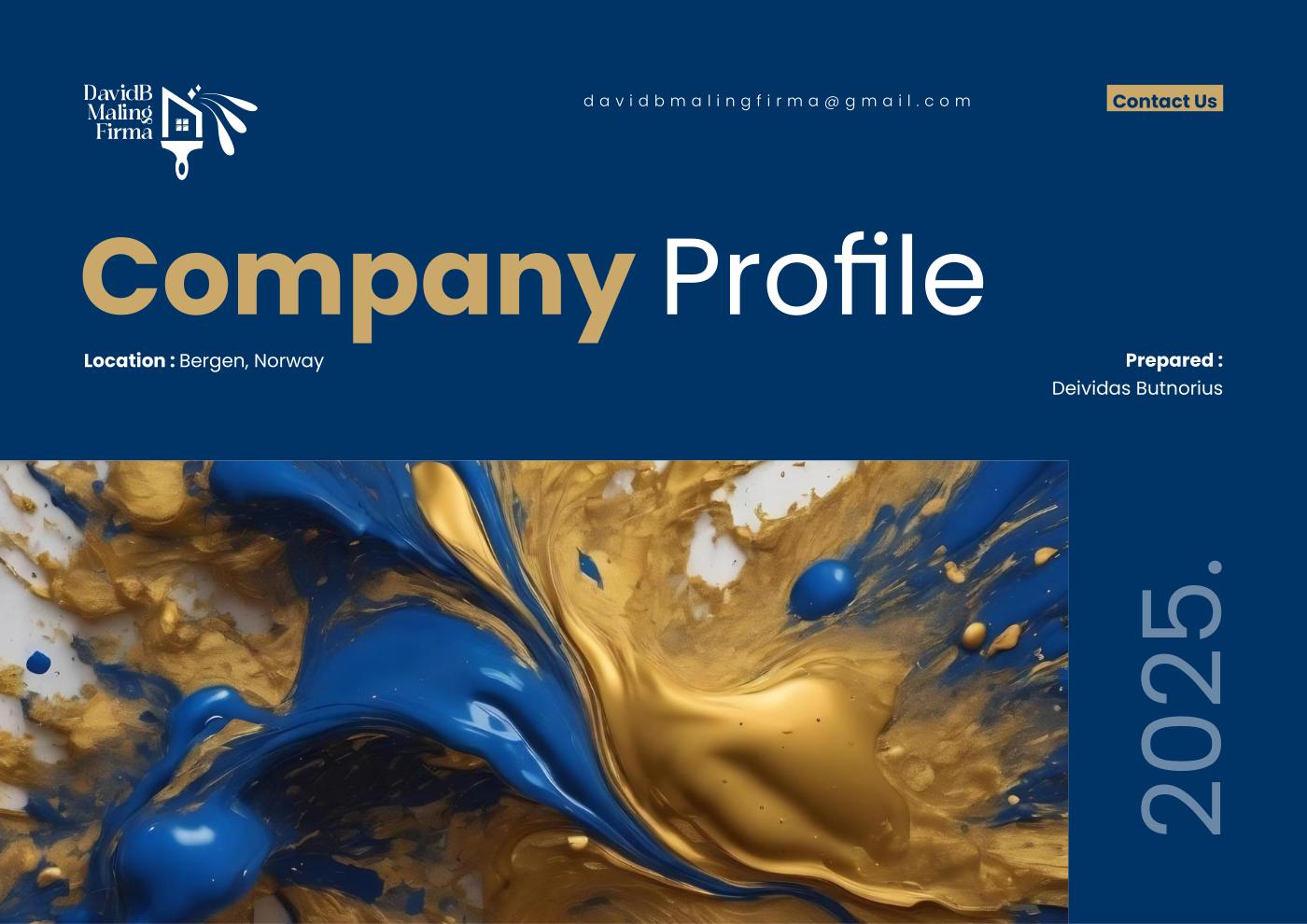
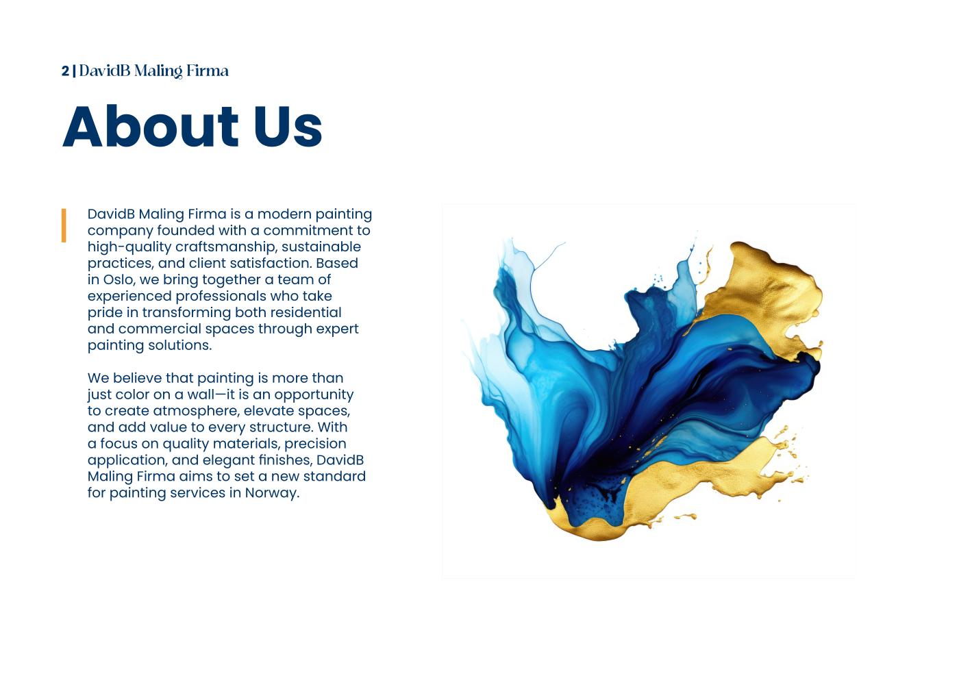
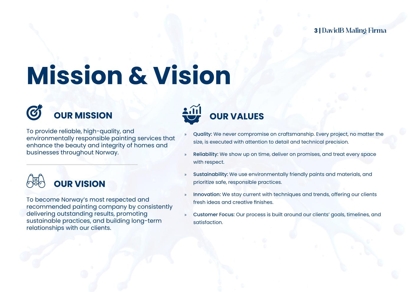
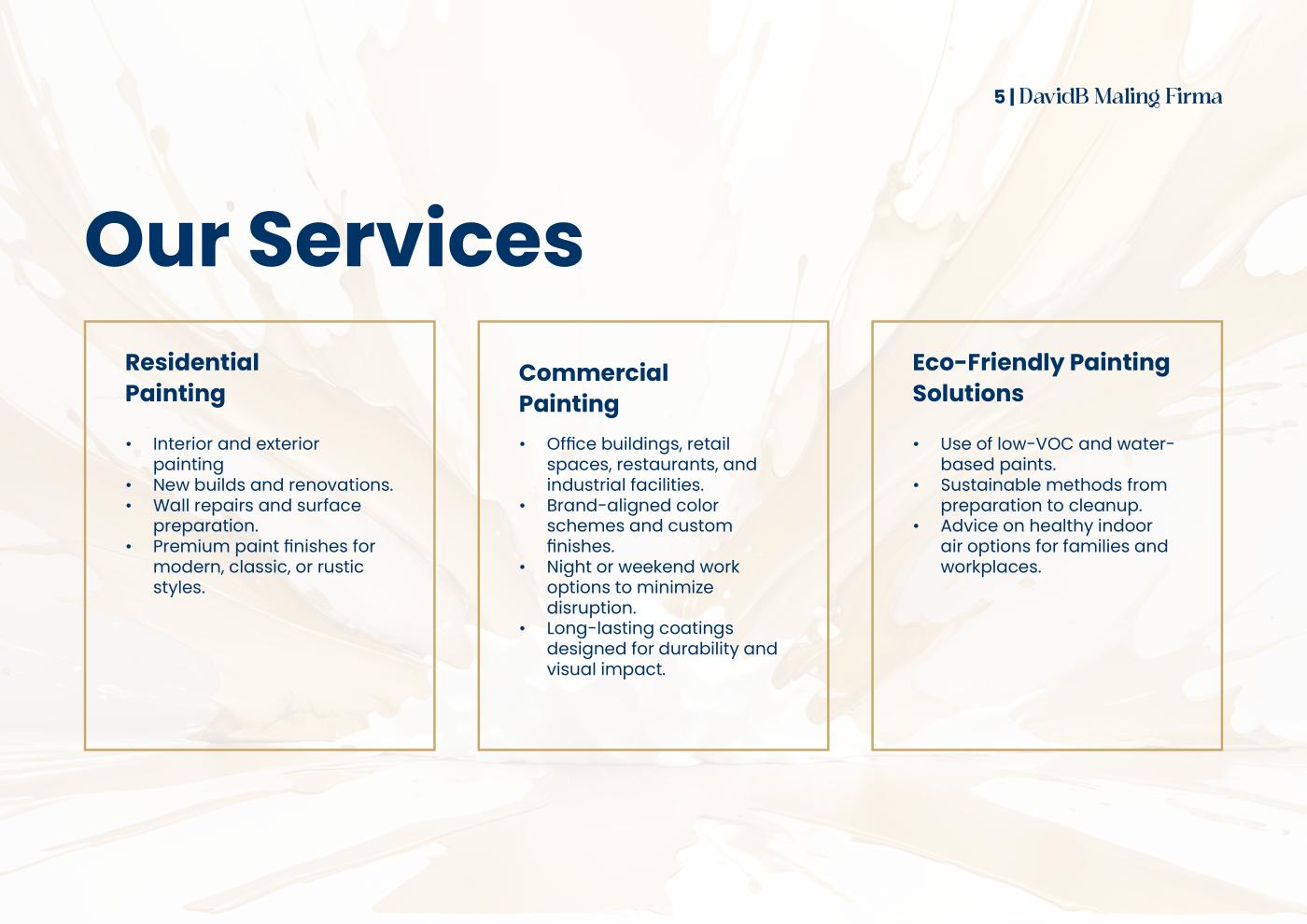
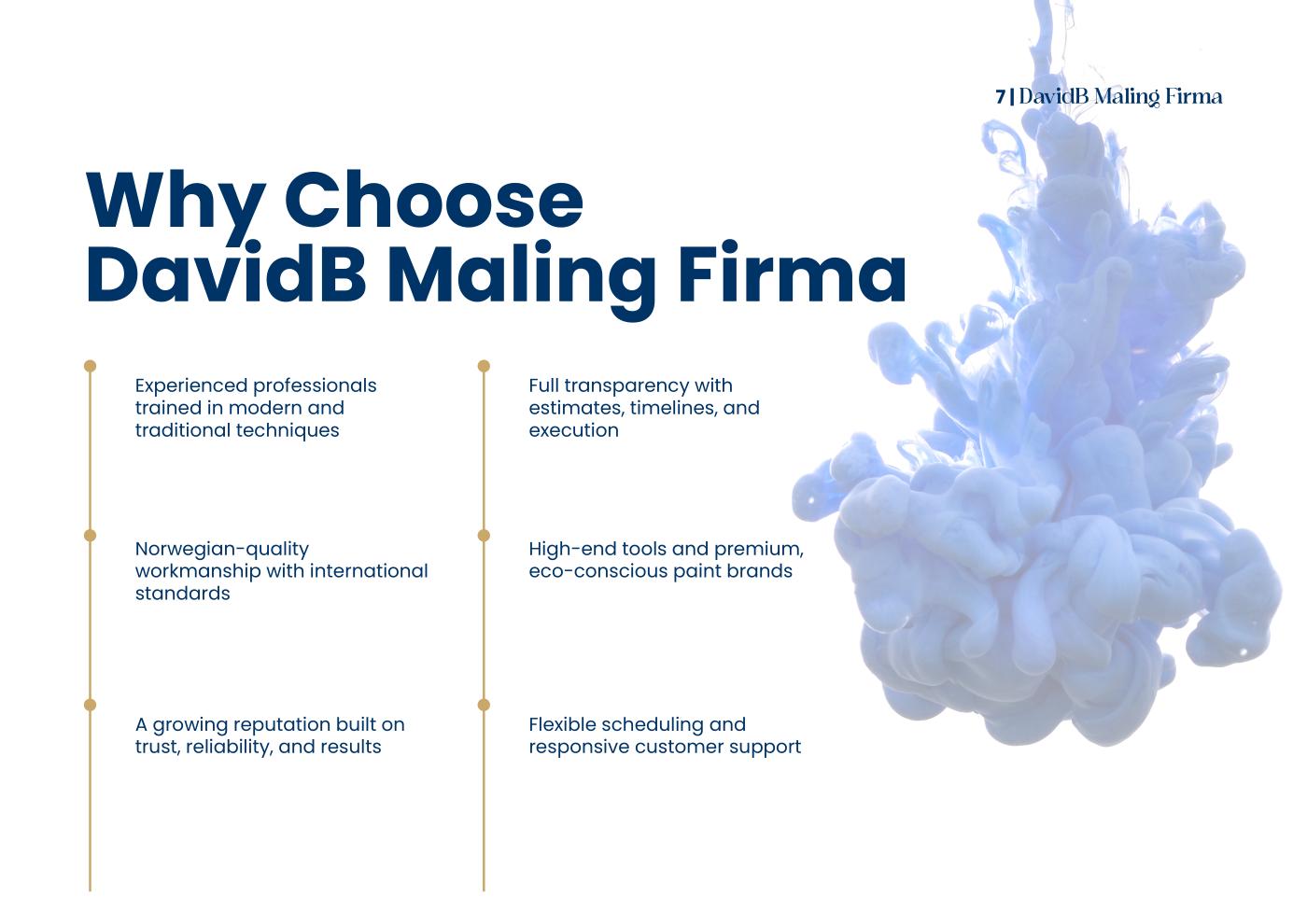
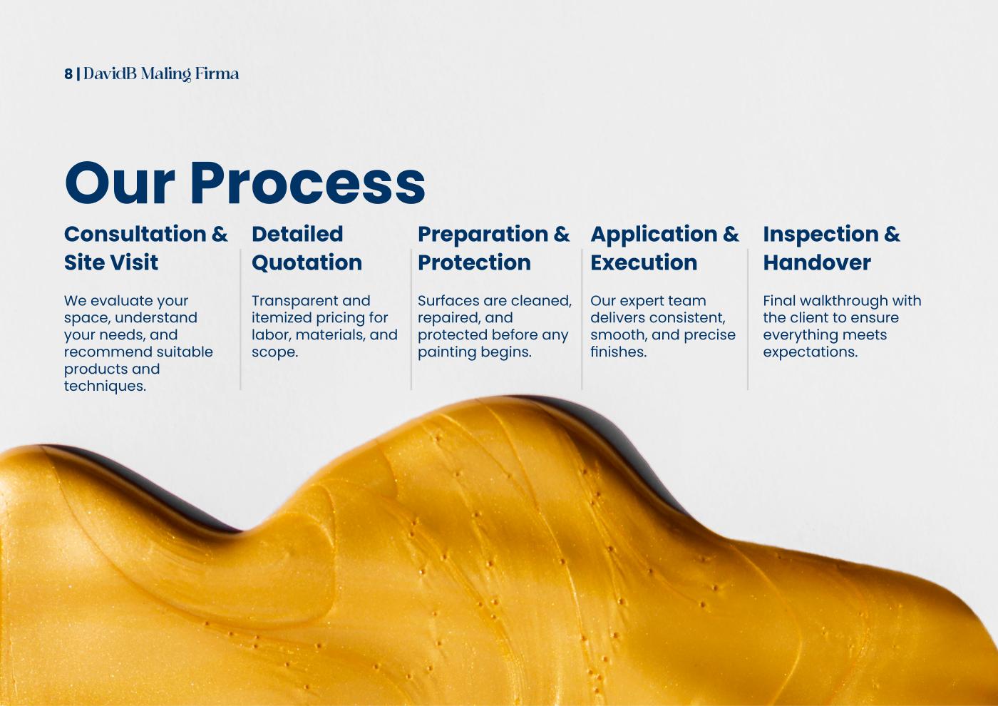
The identity carries into a full company profile — the document that introduces the firm to prospective clients. Cobalt-and-gold paint imagery runs throughout, the serif and navy hold every page together, and the story is laid out cleanly: who they are, mission and values, services, process, and proof. A brand that looks as considered as the finishes it promises.
If this is you
If your product is craft but your brand reads as commodity, buyers can't tell the difference until it's too late. I make the packaging carry the quality that's already in the work.
Next case study
Sprout & Live Hope Foundation →