Case Study — Corporate Identity — Pan-African Holding Company
ADRF — the Africa Diaspora Revival Fund — is a pan-African holding company and movement with a bold ambition: building a self-sufficient and prosperous Africa through investment, enterprise, and community. Its guiding line says it plainly — “African Solutions to African Challenges.”
ADRF isn’t one business but a family of them — a bank, a finance and lending arm, a payments platform, a tokens venture, an investor network, and a foundation — all under one holding company. I built the identity system that lets that whole family speak with one voice.
A holding company with financial ambitions has a hard identity problem: it has to look as trustworthy as a bank, as forward-leaning as a fintech, and as principled as a foundation — all at once, and all recognisably related. A single logo can’t do that. A system can.
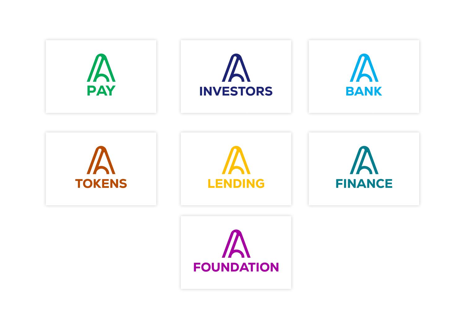
The brand needed a master mark strong enough to anchor everything, and a repeatable way to spin up new ventures — Bank, Finance, Lending, Pay, Tokens, Investors, Foundation — each distinct, each instantly ADRF.
One mark, built to multiply. The identity is anchored by a single monogram — a stylised “A” with an arch rising through it: an A for Africa, a revival arch, a doorway forward. It works alone as an emblem and locks up with the ADRF wordmark.
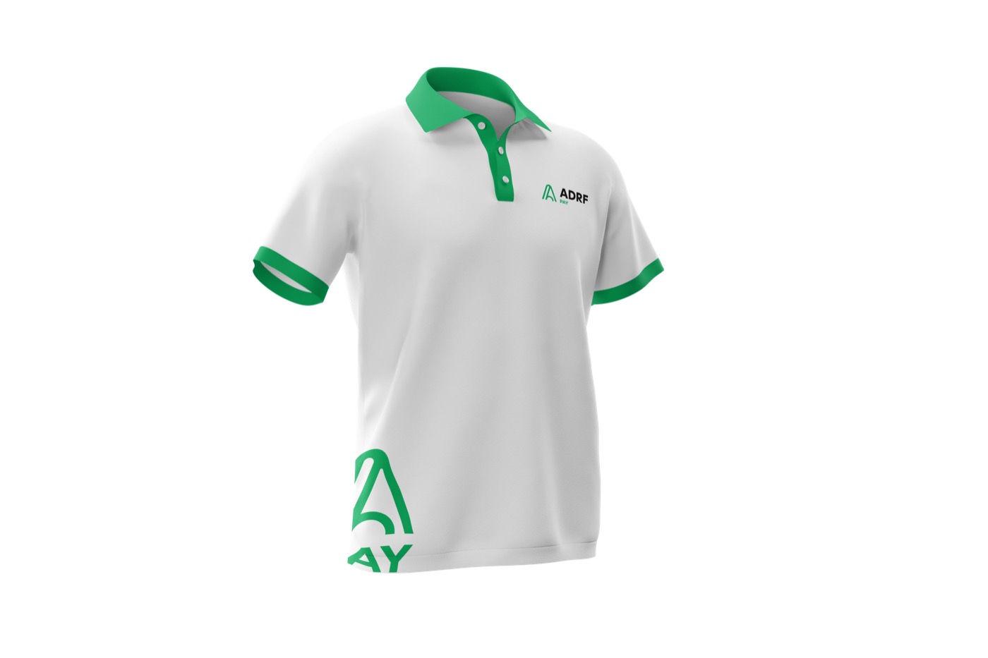
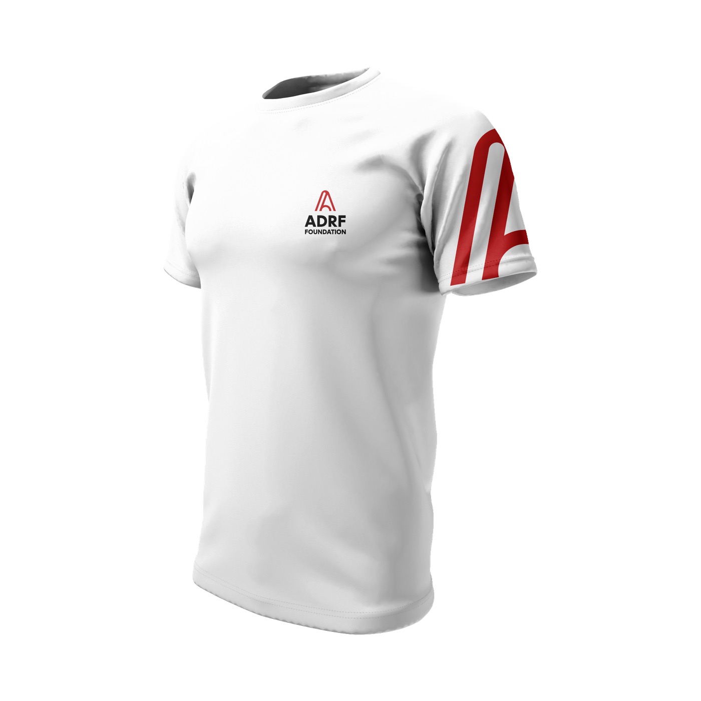
A colour-coded family. The master brand is crimson and charcoal; each venture takes the same monogram in its own colour — green for Pay, navy for Investors, blue for Bank, gold for Lending, teal for Finance, orange for Tokens, magenta for the Foundation. New ventures slot straight into the system.
A disciplined toolkit. Bebas Neue for headlines, Roboto for everything else, a defined palette, and clear rules — so the brand holds from a bank card to a building sign to a vehicle wrap.
The master mark is the ADRF monogram — the “A” and its arch — paired with the wordmark. Crimson red carries confidence and urgency; charcoal grounds it; forest green and soft gold open up the wider system. Defined full-colour, white, and single-colour variants keep it crisp on light, dark, and photographic grounds.
The Monogram — A for Africa
One System, Seven Ventures
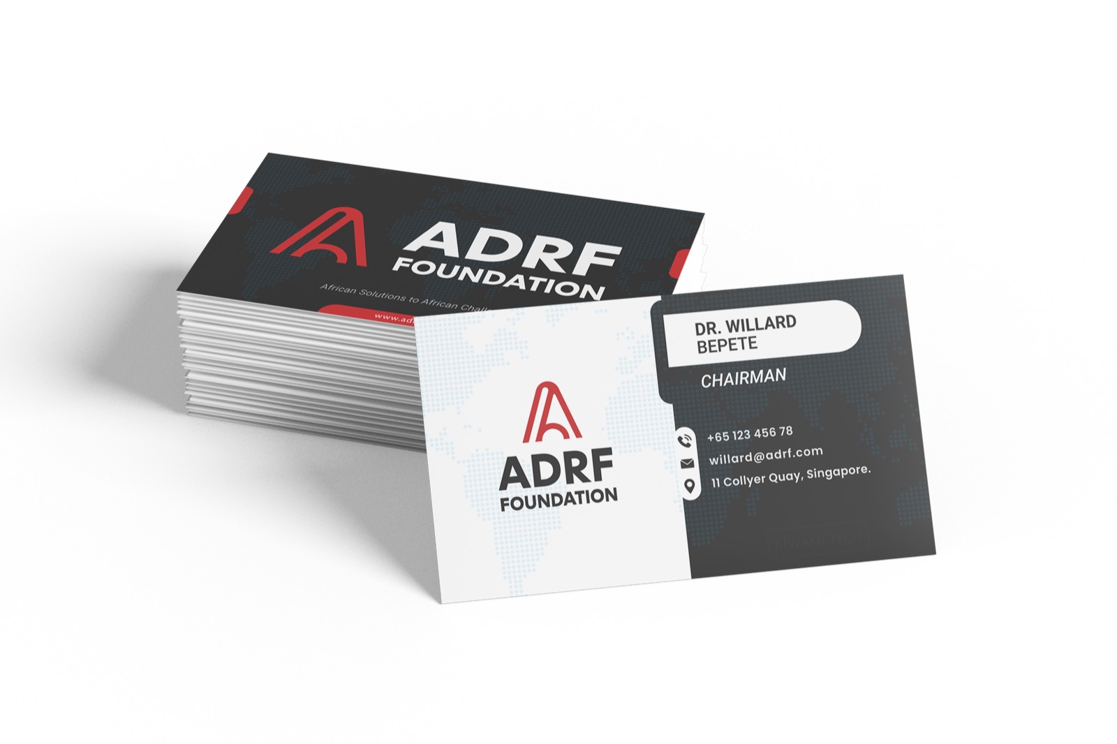
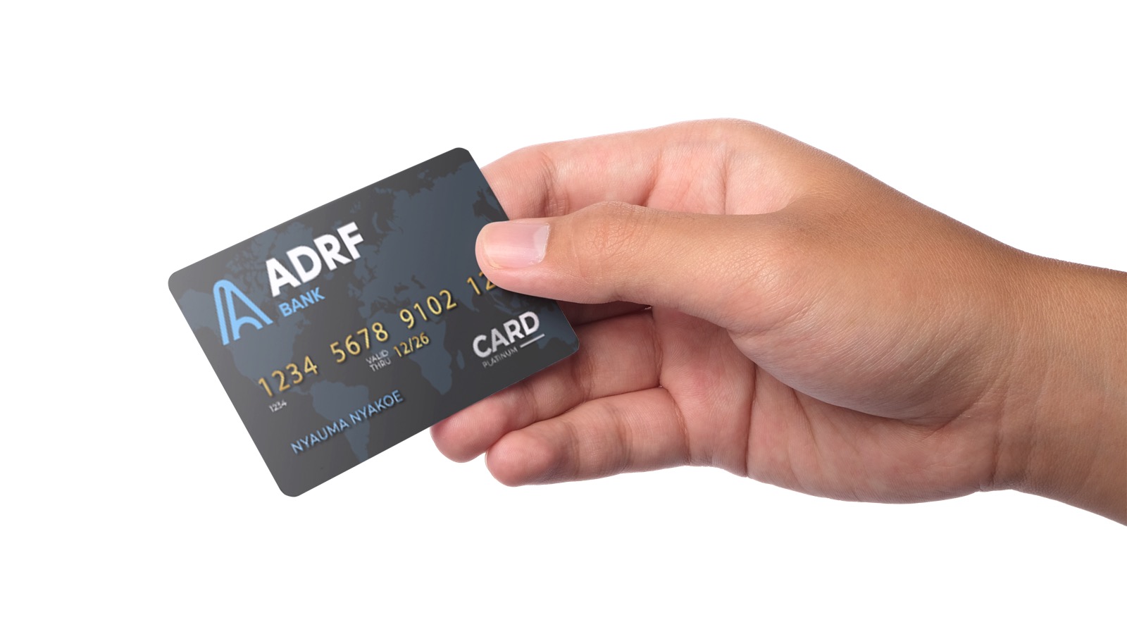
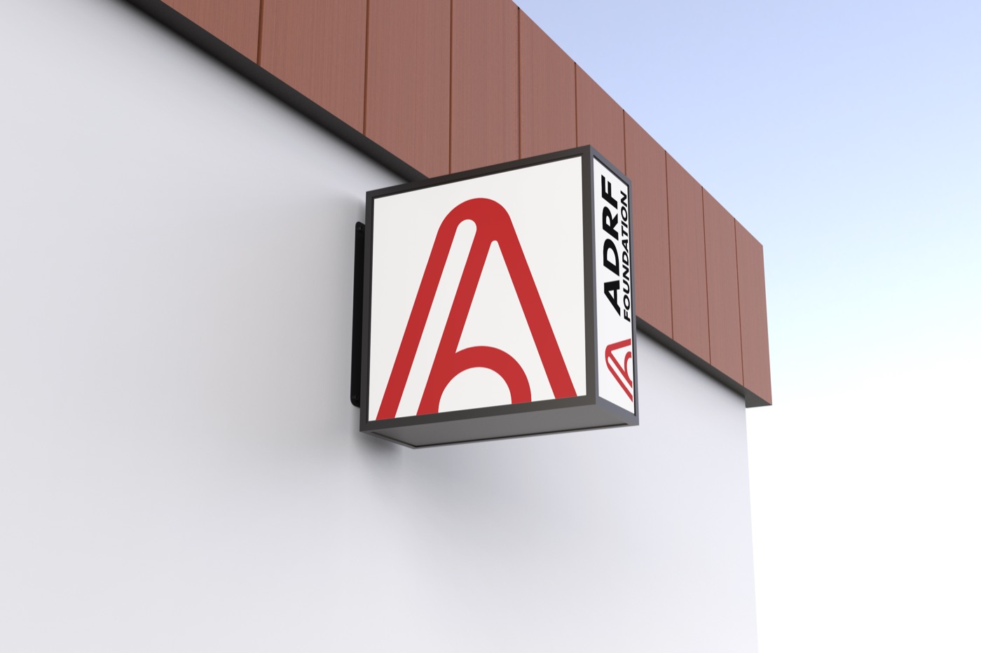
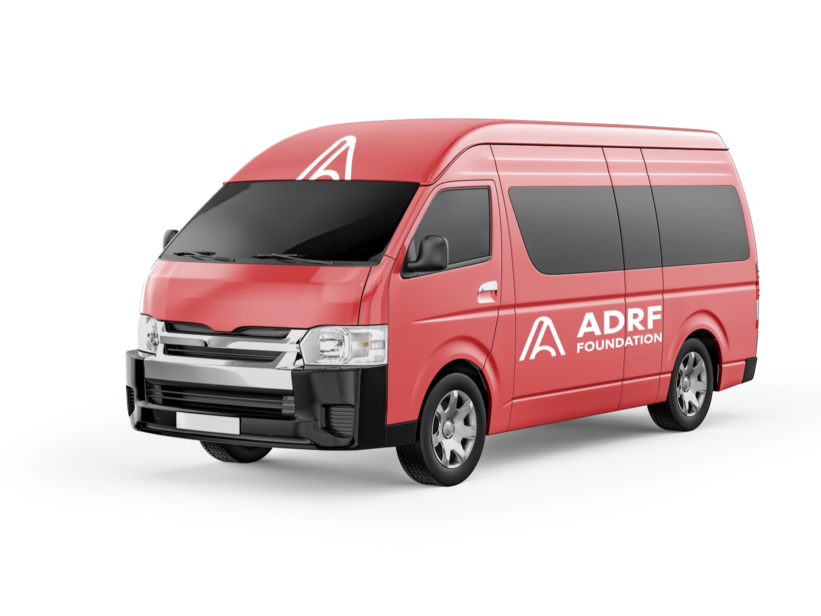
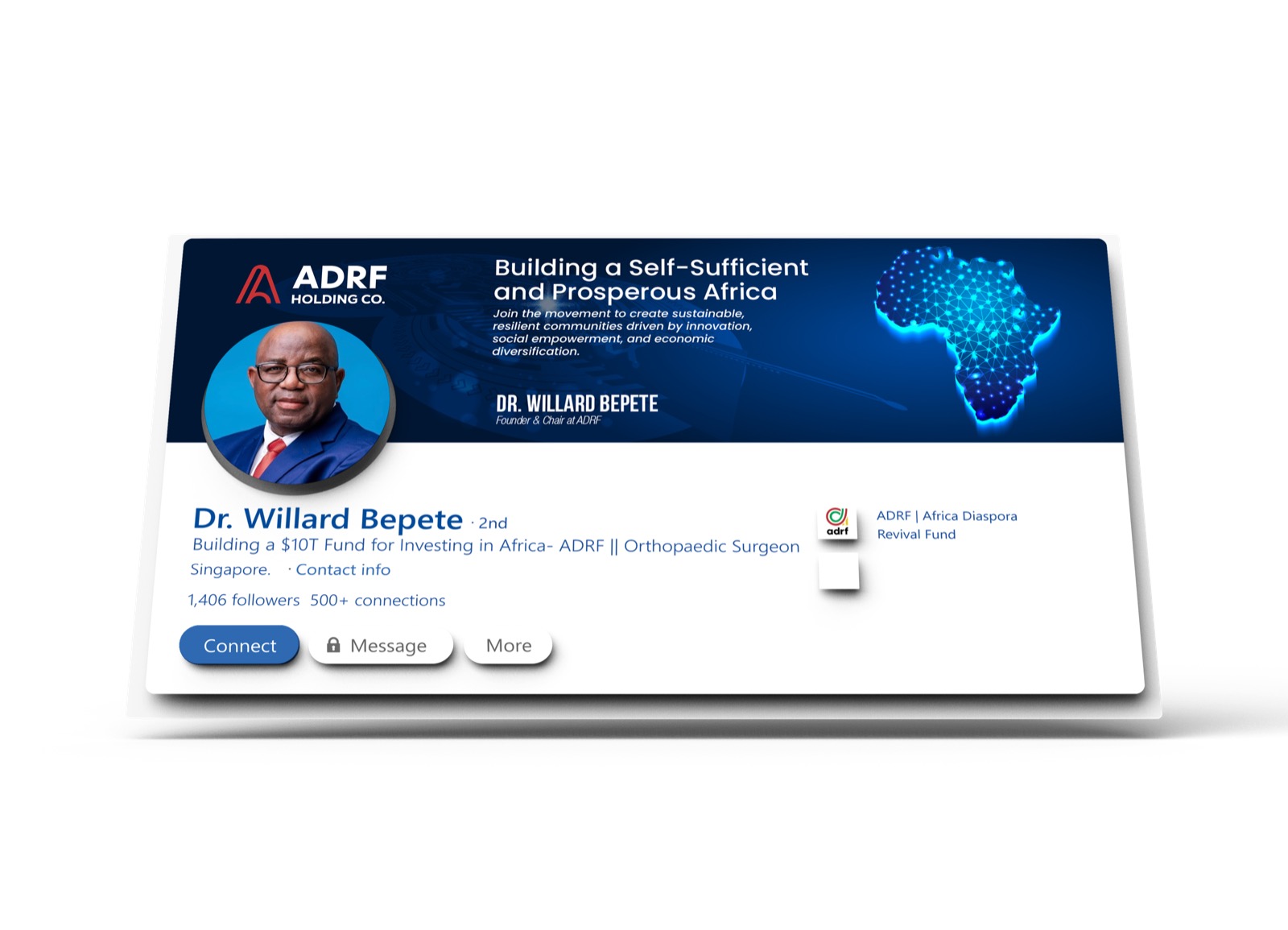
An identity earns its keep in the world, not on a guidelines page. The system runs across the full suite a growing institution needs — stationery and a bank card, apparel, building signage, vehicle livery, and the leadership’s personal and social branding — every piece sharing the monogram, the palette, and the type.


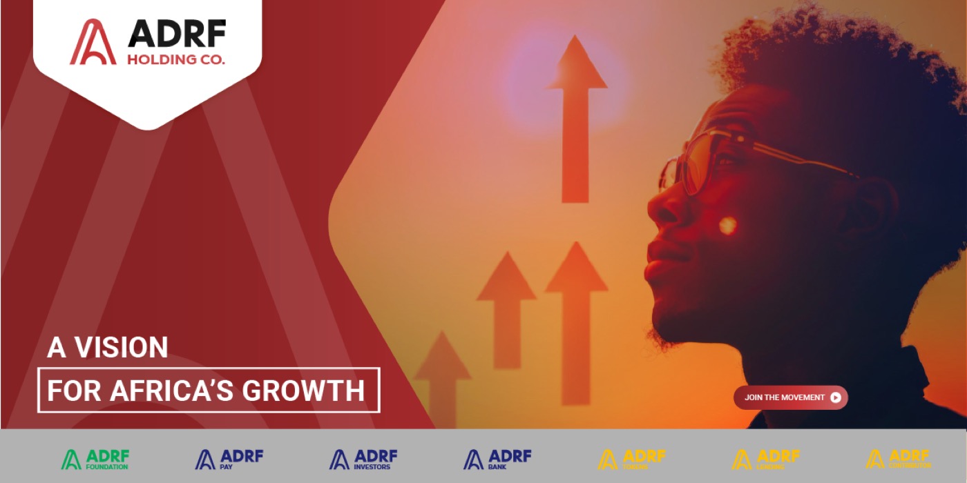
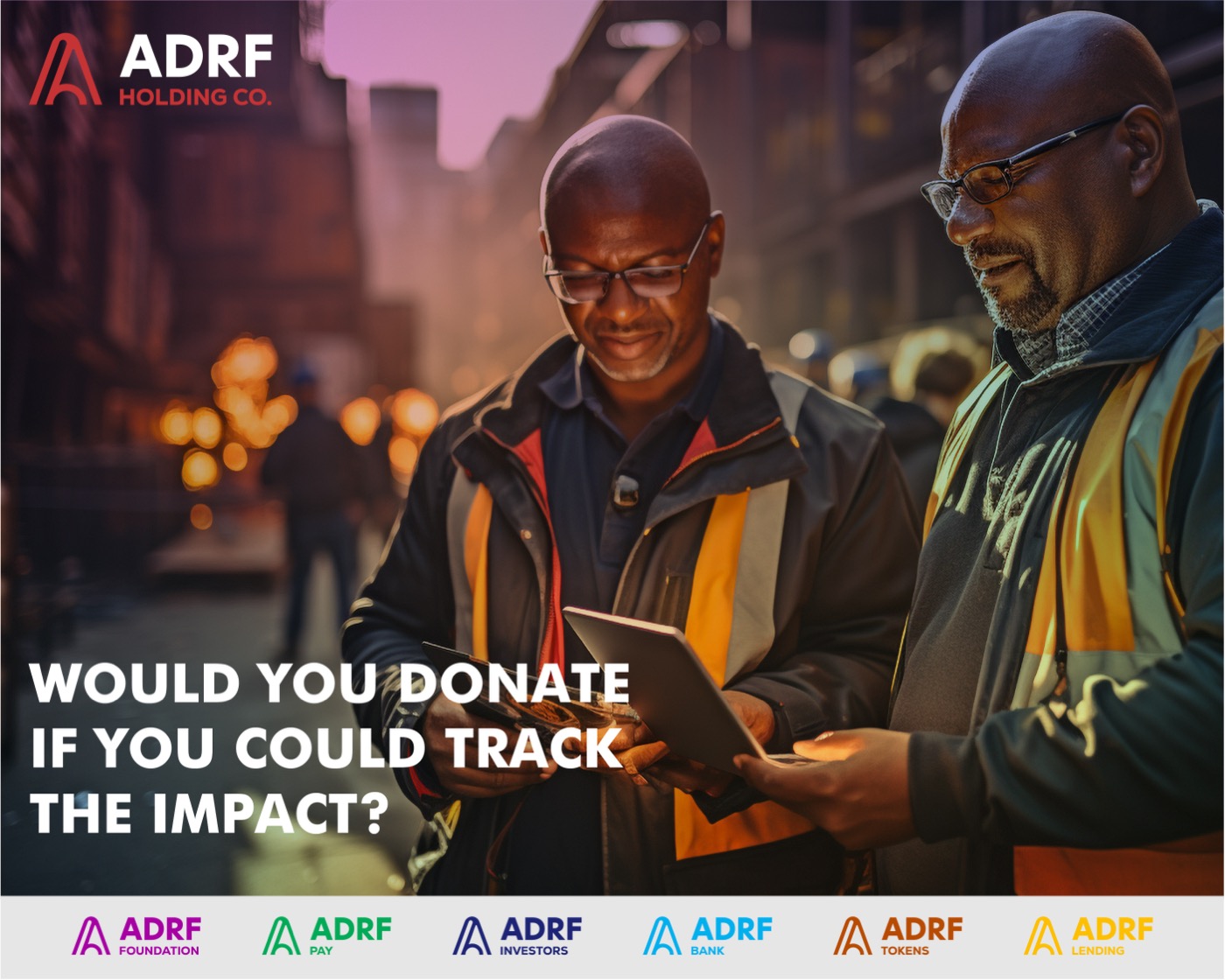
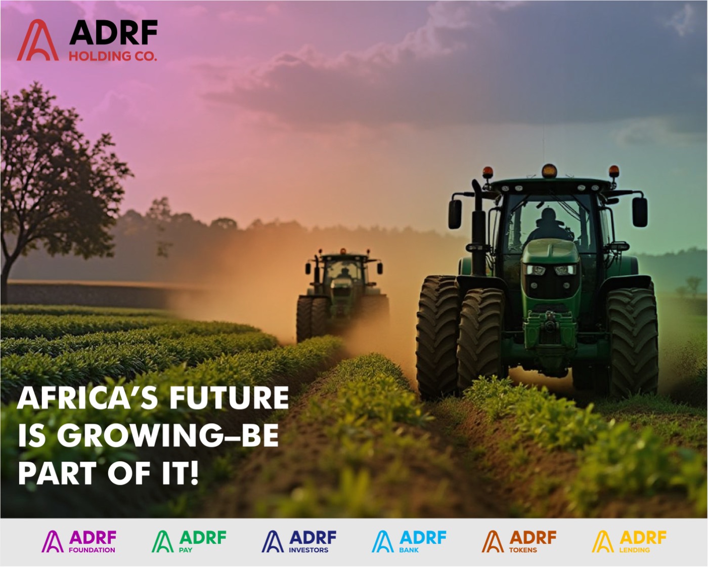
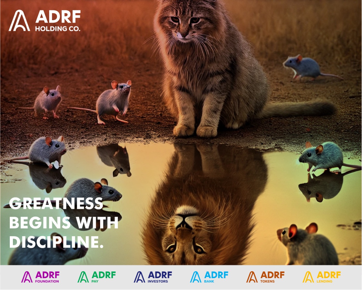
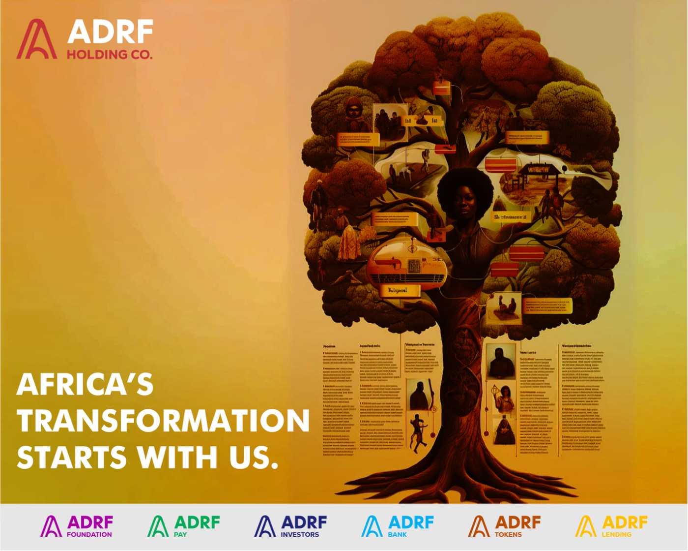
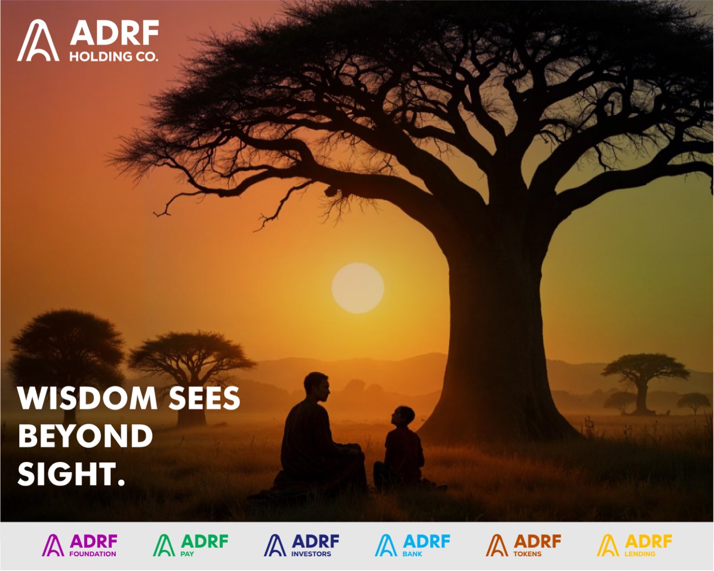
A brand this ambitious lives on the timeline. I ran the identity into a social campaign built on African proverbs, agriculture, and impact — every post fronted by the holding-company lockup, footed by the full venture family, and carrying one call: join the movement.
Two short motion pieces extend the campaign into video — the same palette and lockups, now moving: Africa’s farmland at work, and the human conversations the fund exists to serve.
If this is you
If you're standing up a holding company or a family of ventures, you know the risk: seven brands that look like seven strangers. I give you one system with room for all of them, from the parent identity down to each sub-brand. One family, one voice.
Next case study
Coruscate Consultancy →